What if your data could finally work at the speed of your business?
Traditional business intelligence tools often fail here. They come with complicated setup, steep prices, and long learning curves.
A modern self-service analytics platform removes these barriers. This software is designed for do-it-yourself (DIY) business intelligence.
It allows any team member to build dashboards and reports in minutes. No technical expertise is required.
The core value is unifying information from multiple data sources into a single, accessible platform. You see everything in one place.
This review provides a comprehensive, data-backed look. We examine features, pricing, pros, cons, and suitability.
Our analysis is based on hands-on testing and verified user feedback. We use factual data from the vendor.
This guide helps you decide if this is the right tool for your specific needs and budget. Learn how it can streamline operations and boost performance.
Key Takeaways
- Eliminates complex setup, high cost, and long learning curves associated with traditional BI.
- Enables self-service business intelligence for all team members, not just analysts.
- Unifies data from numerous sources into one accessible, real-time dashboard.
- Allows non-technical users to create custom reports and visualizations quickly.
- This review is based on hands-on testing, verified user reviews, and vendor data.
- Helps you assess if the tool fits your specific business communication and management needs.
- Aims to improve operational efficiency and decision-making speed.
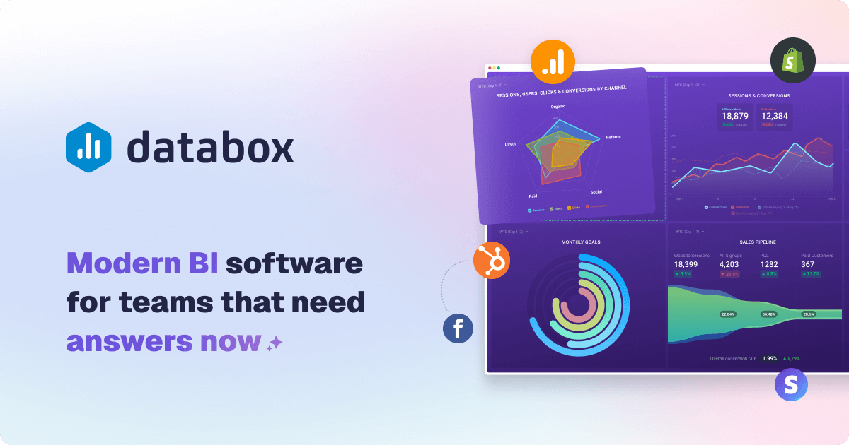
What is Databox? An Introduction to DIY BI
Centralizing all your key metrics into one live view transforms how teams make decisions. A Do-It-Yourself Business Intelligence platform makes this possible for everyone. It empowers users without technical expertise to create dashboards and reports.
This approach is known as self-service analytics. It eliminates dependency on IT or data teams. Anyone in the organization can access and analyze information.
From Dashboards to Full Business Intelligence
The platform started by providing live dashboards as a single source of truth. Teams could see all KPIs at a glance in minutes. Today, it has evolved into a full-fledged BI solution.
Over 20,000 growing businesses now rely on this modern software. It aligns teams and turns data into faster, better decisions. The system includes custom metrics, datasets, and AI-generated insights.
Advanced features like reporting, goals, benchmarks, and forecasts are now standard. This evolution marks a shift from a simple dashboard tool to a comprehensive analytics engine. The focus remains on user-friendly access and actionable intelligence.
Core Purpose: Streamlining Operations and Boosting Performance
The core purpose is to streamline business operations. It centralizes data from multiple data sources into one place. This ends fragmented data silos across departments.
Automating reporting saves significant time. Teams no longer manually compile spreadsheets. Real-time KPI tracking and goal setting drive performance improvements.
Data-driven insights help identify opportunities and issues quickly. Features like AI-powered analysis and predictive forecasting turn raw numbers into strategy. The entire process is designed for efficiency and clear communication.
Teams can focus on improving performance, not managing complex data processes. This user-friendly approach delivers tangible benefits for management and operational needs.
Databox Pricing: A Detailed Look at Costs and Plans
Budget planning for a self-service BI solution requires a close look at what drives the monthly bill. This platform structures its offering across five clear tiers. Each level adds more capacity and advanced tools.
The model is designed for scalability. You pay for the power you need today and can upgrade later.
Free Forever Plan: Getting Started at No Cost
The Free Forever plan is a zero-risk entry point. It includes three data sources and supports three users.
Data syncs happen once per day. This is ideal for testing the software’s core interface and basic dashboard creation.
It provides a genuine feel for the tool without any financial commitment. Small teams or individuals can validate its fit.
Starter Plan: Basic Analytics for Small Teams
Priced at $47 per month with annual billing, the Starter plan is for small, active teams. It allows five users and three data sources.
The sync frequency improves to every four hours. This offers more timely data for daily management and communication.
It’s a cost-effective step up from the free version. Teams gain more user seats and better data freshness.
Professional Plan: Unlimited Users and Hourly Syncs
At $159 per month (annually), the Professional tier unlocks significant scale. It includes unlimited users and three data sources.
Data updates hourly, providing near real-time insights. This plan suits growing businesses that need wider internal access.
Custom analytics and reporting features become more accessible. It’s built for teams focused on performance and efficiency.
Growth Plan: AI Features and Advanced Reporting
The Growth plan costs $359 per month with annual billing. It includes all Professional features plus AI-powered analysis.
This tier introduces predictive insights and advanced reporting capabilities. Syncs remain hourly, and user seats are unlimited.
It is the first plan where artificial intelligence tools are available. These features automate insight generation and summaries.
Premium Plan: Enterprise-Level Security and Support
For large organizations, the Premium plan is $799 per month (billed annually). It includes 100 data sources by default.
This plan adds enterprise-grade security protocols and 24/7 priority customer support. User access remains unlimited with hourly syncs.
It becomes economically sensible for companies connecting roughly 90 or more tools. The value proposition shifts to volume and security.
Understanding the Cost Drivers: Data Sources vs. Users
The primary cost driver is the number of active data sources, not users. All paid plans offer unlimited user seats.
Additional connectors cost $5.60 each per month. This can quickly increase your bill on lower-tier plans with only three included sources.
For example, connecting ten sources on the Professional plan adds significant cost. The Premium tier is designed for heavy data integration needs.
When selecting a plan, first count your essential data sources. Then, consider your need for AI features and sync frequency.
This approach ensures you pay for value and avoid unexpected expenses. The right plan aligns with your current data complexity and growth trajectory.
Ease of Use: How Quick is Setup and Adoption?
Getting a dashboard live and sharing insights should be a matter of minutes, not days. The promise of rapid deployment is a major selling point for modern analytics platforms. This section examines how quickly teams can move from sign-up to a functional, shareable view of their performance.
Vendor claims suggest you can build your first dashboard in under five minutes. User testimonials largely support this for basic setups. Most teams achieve a share-ready state within 5 to 15 minutes.
The initial experience is designed to be fast and intuitive. Connecting your first data source is a guided process. You then select a visual template and watch live numbers populate instantly.
This streamlined approach eliminates traditional barriers to entry. It empowers users to focus on analysis and communication instead of complex configuration.
Drag-and-Drop Dashboard Builder
The core of the user interface is a visual designer. This drag-and-drop builder allows for intuitive placement and resizing of charts and metrics.
You can change visualization types with a single click. Color-coding numbers for quick interpretation is also simple. The layout adjusts dynamically as you add or remove components.
This design philosophy puts control directly in the user’s hands. No coding or technical expertise is required for standard dashboards. It significantly reduces the time to first insight for business teams.
Pre-Built Templates for Fast Deployment
A library of over 200 pre-built templates accelerates deployment. These cover a wide range of use cases like Google Ads, Shopify, and executive KPIs.
Choosing a template provides an instant, professional structure. Your connected data flows into the predefined charts and graphs. This is a major efficiency benefit for common reporting needs.
However, these templates operate on a fixed grid layout. This can limit free-form design for teams wanting highly customized visuals. For most standard business communication, the templates are more than sufficient.
Learning Curve for Advanced Customizations
While basic setup is straightforward, mastering deeper features requires exploration. Creating custom metrics or blending data from multiple data sources involves a steeper learning curve.
Some advanced actions are tucked into nested menus. Power users may need time to discover all available options. The unified interface does reduce context-switching once you learn it.
Cloning dashboards for multiple clients is a simple process. Yet, editing each cloned dashboard individually can become tedious over time. User reviews note that while the platform excels at rapid initial setup, complex, tailored implementations demand patience.
The tool is excellent for beginners needing quick wins. For advanced customizations, expect to invest time in learning the full scope of its capabilities. This balance makes it accessible while still offering powerful reporting features for growing needs.
Integrations and Data Connectivity
The breadth and reliability of available connections define the practical utility of any analytics platform. Your dashboards need a steady flow of live information from the tools your team uses every day.
This section examines how the software connects to your data. We look at the wide range of native integrations and custom options. More importantly, we assess the real-world stability of these vital links.
130+ Native Integrations with Popular Tools
The platform offers a strong starting point with over 130 one-click connectors. These cover major categories like marketing, sales, finance, and customer support.
You can instantly link popular services like Google Analytics, HubSpot, Shopify, and Meta Ads. This pre-built access is a major time-saver during the initial setup process.
Having these integrations ready means you skip complex API coding. Teams can start building performance dashboards in minutes, not days. It brings data from multiple data sources into one place for clear communication.
Custom Data Sources: API, Google Sheets, and CSV
For data not covered by native links, the tool provides three main methods. Developers can use the REST API or Push API with official SDKs.
Non-technical users have simpler options. You can connect a Google Sheets or Excel file directly. Uploading a CSV file is also a straightforward process.
However, the API route has notable challenges. User reviews mention that documentation can be sparse. The Python SDK, in particular, may have installation issues with limited community support.
For basic custom metrics, Sheets and CSV uploads work well. For complex, automated systems, expect to invest more development time.
Reliability and Stability of Connections
This is where many users report significant challenges. The initial connection is easy, but maintaining it is another story.
Agencies frequently see “re-authentication needed” pop-ups. API tokens can expire without clear warning, breaking the data sync. When a connector fails, all dependent charts and templates go blank.
One severe user report cited the platform being down for nearly three weeks. Such instability creates major risks for client reporting and internal management.
Competitors like Whatagraph highlight engineered reliability as a core feature. They offer systems like SOS alerts for broken connections. Databox’s approach can lead to manual intervention and support tickets.
For agencies managing many client accounts, this is a critical factor. Frequent downtime and slow customer support response times hurt efficiency.
The integration list is impressive. But for mission-critical reporting needs, day-to-day connection stability may not meet expectations. Always factor potential data gaps into your management process.
Data Organization, Filtering, and Blending
Beyond simple dashboards, the ability to filter, blend, and calculate custom metrics defines analytical depth. This is where a platform’s real power for performance management is tested.
Can it turn raw numbers from different apps into a unified business story? The answer depends on its data preparation features.

Metric Builder for Custom Calculations
The software includes a no-code Metric Builder. This feature lets you create custom KPIs by stitching numbers from multiple data sources.
For example, you can calculate Customer Acquisition Cost (CAC). The formula would be Ad Spend divided by New Customers.
This is a powerful tool for essential business analysis. Teams can define ROI, profit margins, or blended rates without spreadsheets.
It brings calculation logic directly into the reporting interface. This saves time and improves communication of key results.
Limitations in Data Blending and Dimensions
A significant limitation surfaces here. For most data sources, you can only apply one dimension per custom metric.
Google sources are an exception. For others, analyzing by campaign, region, and device simultaneously isn’t possible.
The common workaround is duplicating the metric for each dimension. This increases manual setup and clutters your dashboard.
More critically, this is basic calculation, not true relational blending. The platform aggregates numbers but cannot join tables on shared keys like “Campaign Name.”
Deep cross-source analysis, such as multi-touch attribution, remains out of reach. The data organization is sufficient for combining figures but restrictive for advanced modeling.
Comparison with Competitors on Data Flexibility
User reviews frequently highlight this gap. Some report calculation inaccuracies and wrong KPIs appearing in dashboards.
This forces manual verification, hurting operational efficiency. Trust in automated reporting drops when numbers don’t align.
Competitors approach this differently. Tools like Whatagraph offer unlimited data blends and custom dimensions through an “Organize” feature.
They enable true cross-platform unification at the dataset level. This provides more flexibility for complex business needs.
If your analysis requires sophisticated data preparation, evaluate platforms with robust blending capabilities. The tool discussed here excels in speed and accessibility but has limits for advanced analytics.
Choose based on your current and future data complexity. For basic combining and calculated metrics, it works well. For intricate, multi-dimensional analysis, you may need a more powerful solution.
Visualization Tools and Dashboard Templates
The visual presentation of your data is not just about aesthetics. It’s the critical bridge between raw numbers and actionable understanding.
This platform provides the tools to build that bridge quickly. You get a powerful drag-and-drop designer and a vast library of starting points.
The goal is to turn complex information into clear, compelling stories. This drives better business communication and decision-making.
20+ Visualization Types for Clear Insights
Choosing the right chart is key for comprehension. The software offers over twenty different visualization options.
These include standard bar charts, line graphs, and pie charts. You also get specialized tools like gauges, scorecards, and trend lines.
Each type serves a specific analysis need. A scorecard highlights a single key metric. A trend line shows performance over time.
This variety ensures you can match the visual to your message. It enhances storytelling and makes reporting more effective for all users.
200+ Pre-Built Templates for Various Use Cases
Starting from scratch can slow down your process. The platform solves this with an extensive template library.
More than 200 ready-made dashboards cover common industries and functions. You’ll find templates for SaaS metrics, e-commerce, marketing, and sales.
Selecting a template provides an instant, professional layout. Your connected data flows directly into the predefined charts.
This drastically cuts the time to your first insight. It’s a major efficiency benefit for standard reporting needs.
All templates use a fixed grid system. This ensures consistency but limits completely free-form layout adjustments. Designers seeking unlimited creativity may find this restrictive.
The key advantage is live data. Templates are not static snapshots. They display current information, keeping reports always relevant.
Mobile and TV Views for Accessibility
Insights should be available anywhere, not just on a desktop. The tool is built with accessibility in mind.
Dashboards are fully mobile-responsive. Teams can check key metrics from their phones or tablets with ease.
For office settings, a dedicated TV view mode is included. This allows for always-on display of live dashboards on large screens.
It turns your data into a central focal point for teams. This supports real-time performance management and collective focus.
You maintain access and control from a single interface. The same dashboard works seamlessly across all devices.
In summary, the visualization feature set is strong for most business users. It balances ease of use with professional output. For highly custom, artistic layouts, the fixed grid is a trade-off to consider.
Advanced Analytics and AI Features
A dashboard shows what happened. Advanced analytics explains why and predicts what’s next.
This is where a business intelligence platform moves from passive monitoring to active investigation. It turns historical numbers into a strategic asset for planning.
The right software provides built-in tools for this deeper analysis. You gain AI summaries, data drilling, and forecasting.
These features transform your reporting process. They save significant time and uncover hidden opportunities.
AI-Powered Insights and Summaries
Artificial intelligence automates the initial analysis of your performance data. The system can automatically highlight unusual spikes or drops in your metrics.
It generates natural language summaries of weekly or monthly results. This feature identifies key trends and anomalies without manual review.
However, AI capabilities are gated behind the Growth and Premium plans. This affects cost considerations for teams wanting automated insights.
You need to invest in a higher-tier plan to access this power. For businesses ready to scale, it’s a compelling value-add.
Drill-Down to Row-Level Data
Seeing a KPI change is one thing. Understanding the exact transactions behind it is another.
Drill-down functionality allows you to click any number on your dashboard. It reveals the raw, row-level data that composes the aggregate figure.
This turns reporting from monitoring into investigation. You can answer the “why” behind the numbers instantly.
It enables root-cause analysis and improves business communication. Teams move faster from spotting a problem to fixing it.
Forecasting and Predictive Analytics
Planning requires looking forward, not just backward. Forecasting tools use your historical data to project future values.
With one click, you can generate trend-based predictions for key metrics. This aids in resource allocation and goal setting.
It helps identify potential risks and opportunities proactively. Your management process becomes more strategic and data-informed.
These predictive features require clean, well-structured data from your connected sources. Accurate inputs are essential for reliable outputs.
In summary, advanced analytics and AI are powerful differentiators. They position the tool as accessible yet capable of deep analysis.
For companies investing in Growth or Premium plans, these features deliver tangible efficiency benefits. They turn static dashboards into interactive business intelligence engines.
Reporting, Automation, and Sharing
Automated reporting transforms static dashboards into dynamic communication tools that drive action. The real value of analytics is unlocked when insights flow automatically to stakeholders.
This eliminates manual distribution and keeps everyone aligned. A robust system handles scheduling, formatting, and secure sharing.
You save significant time and improve business communication. The right features ensure your data works for you around the clock.
Automated Reports via Email and Slack
You can schedule any dashboard or report to be sent automatically. Choose daily, weekly, or monthly intervals for delivery.
Recipients get updates directly in their email inbox or Slack channel. Mobile notifications are also an option for on-the-go management.
This process ensures stakeholders receive the latest performance metrics without manual effort. It fosters a consistent, data-driven rhythm for teams and clients.
The automated distribution is a major efficiency benefit. It turns your dashboard into a proactive reporting engine.
Page and Slide Reports for Presentations
Not all reporting needs are the same. The platform offers two distinct formats for different audiences.
Page Reports are detailed, multi-page documents. They are ideal for in-depth analysis and comprehensive reviews.
Slide Reports are condensed, presentation-ready decks. They highlight key takeaways in a visual, digestible format.
Both formats pull live data from your connected sources. You can brand them with your logo and colors for a professional look.
This flexibility supports various communication needs. From board meetings to client check-ins, you have the right format.
Sharing Dashboards with Clients and Teams
Sharing insights is straightforward. You generate a secure, view-only link for any dashboard.
This link can be sent directly to team members or external clients. You can also embed dashboards into internal portals or client websites.
Shared views support collaboration. Users can add notes, assign goals, and set alerts directly within the interface.
This easy access helps build a culture where metrics are central to decisions. It puts data in one place for everyone.
However, a key limitation exists for agencies. There is no true master template system.
If you clone a report for multiple clients, edits to the original are not inherited. You must update each copy manually, which hurts efficiency at scale.
Competitors like Whatagraph offer linked templates. Changes to a master template propagate automatically to all connected reports.
This smarter management significantly reduces maintenance for firms with many accounts. It’s a notable feature gap for heavy reporting workflows.
In summary, the automated reporting and sharing capabilities are robust for most business needs. They save time and enhance communication.
The system could be enhanced with smarter template inheritance. This would better serve agencies managing numerous client accounts.
User Reviews and Ratings from G2 and Capterra
Independent review platforms like G2 and Capterra provide a crucial reality check for business tools. They aggregate feedback from actual customers who use the software daily.
This collective voice reveals practical strengths and weaknesses. It goes beyond marketing claims to show real-world performance.
For any analytics platform, user reviews are a vital resource. They highlight how the tool functions in diverse environments.
Prospective buyers can gauge reliability, ease of use, and support quality. This section examines the verified feedback for this specific business intelligence solution.
Overall Ratings: 4.4 on G2 and 4.7 on Capterra
The platform holds strong aggregate scores on major review sites. It earns 4.4 out of 5 stars on G2, based on over 1,000 reviews.
On Capterra, the rating is even higher at 4.7 stars. These numbers indicate generally positive user sentiment.
The volume of feedback suggests a substantial and active user base. This lends credibility to the ratings, as they are not based on a small sample.
High scores typically reflect satisfaction with core features and value. They are a good initial indicator of a product’s market fit.
Common Themes in User Feedback
A clear trend emerges when reading through the detailed comments. Many reviews follow a “yes, but” pattern.
Positive remarks are often tempered with a specific caveat or criticism. This nuanced feedback is more telling than the star rating alone.
Users consistently praise the software for its fast setup and intuitive interface. They highlight the comprehensive library of native integrations.
Connecting data from multiple data sources into one place is a frequently cited benefit. The drag-and-drop builder and time-saving templates also receive commendation.
Common criticisms focus on three main areas. First, cost can escalate quickly when adding extra data sources beyond the plan limit.
Second, customer support response times are sometimes reported as slow. Third, some users encounter reliability issues with specific templates or metric calculations.
For example, a G2 reviewer named Robert R. praised the data visualization power. He also noted a learning curve for advanced customizations.
Discussions on Reddit and other forums echo this mixed sentiment. Users highlight both the platform’s strengths and their frustrations with certain limitations.
This feedback suggests potential pain points a prospective buyer should investigate. While the overall ratings are high, the detailed user reviews provide essential context.
It is wise to read recent reviews to gauge current performance. Support quality and feature reliability can change over time.
This analysis helps you make a more informed decision. It balances the impressive scores with the practical experiences of everyday users.
Pros of Databox: What Users Love
The most compelling advantages of any software are those that users consistently praise in their daily work. For this business intelligence platform, the strengths highlighted in user reviews form a clear pattern. They focus on immediate usability, comprehensive connectivity, and streamlined reporting.
These benefits translate directly into time savings and better performance management. Teams can move from setup to insight with remarkable speed.

Fast Setup and Intuitive Interface
Many users report creating a functional, shareable dashboard in under an hour. Some achieve this in just minutes. This rapid deployment is a major selling point for teams needing quick wins.
The drag-and-drop builder is central to this ease. New team members require minimal training to start building. Robert R. on G2 specifically calls it the best “data visualization tool” he has used.
The entire interface is designed for self-service. It empowers non-technical staff to own their reporting process. This eliminates bottlenecks and speeds up decision-making.
Comprehensive Integrations in One Place
Reviewers love the ability to pipe data from GA4, HubSpot, and ad channels into a single screen. The platform offers over 130 native connectors.
This brings marketing, sales, and finance data sources into one place. It ends debates over data silos and creates a unified source of truth.
Connecting multiple data sources is a straightforward process. The extensive integration library is frequently cited as a top benefit in user reviews.
Time-Saving Templates and Live Data
With more than 200 pre-built templates, users skip design work entirely. These templates provide professional layouts for common use cases like e-commerce or executive KPIs.
Selecting a template instantly populates a dashboard with your connected data. The software updates these views automatically with live numbers.
Stakeholders always see current metrics without manual refreshes. This ensures reports are always relevant and interactive.
Another key advantage is unlimited users on paid plans. Teams can collaborate without per-seat fees, fostering a data-driven culture.
In summary, these pros make the tool an attractive choice. It delivers quick time-to-value and centralizes information in a powerful way. The benefits of fast setup, deep connectivity, and automated data flow provide significant efficiency gains for growing businesses.
Cons of Databox: Where Users Face Challenges
Despite its many advantages, some users encounter significant hurdles that affect their daily workflow and trust in the system. These challenges often surface after the initial setup phase, when reliance on the platform grows.
Critical feedback from long-term customers highlights areas where expectations are not met. These issues can impact operational efficiency and client relationships.
Pricing Can Escalate with Additional Data Sources
The pricing model is a common point of frustration for growing teams. While base plans seem affordable, costs can rise quickly.
Each extra connector beyond your plan limit costs $5.60 per month. For agencies linking many tools, this adds up fast.
A mid-tier plan with only three included sources becomes expensive. Connecting ten marketing and sales platforms creates a surprisingly high bill.
This structure makes budget forecasting difficult. The cost driver is clearly the number of active data sources, not users.
Businesses must carefully count their essential integrations. Unexpected expenses can hurt financial planning and management.
Customer Support Response Times
Many user reviews note a decline in customer service quality. Response times have slowed considerably in recent years.
Queries sometimes go unanswered for days. This delay is problematic when reports break before client meetings.
Agencies facing deadlines find this lack of support stressful. It damages their own service reputation and client trust.
Some users report unhelpful interactions when issues are complex. The customer support experience no longer matches the software’s premium positioning.
Alternatives like Whatagraph are praised for responsive, helpful assistance. This comparison is frequently made in community discussions.
Template and Metric Reliability Issues
Perhaps the most serious concern is data reliability. Widgets and templates can stop pulling information without warning.
Metrics sometimes display inaccuracies or default to the wrong account. This forces manual verification, wasting valuable time.
Guy M. on G2 detailed two years of client reporting headaches. He experienced broken templates and metrics that took months to fix.
Such instability erodes confidence when presenting numbers to leadership or clients. Trust in automated analysis diminishes when errors occur.
These reliability problems suggest a need for more robust integration testing. For mission-critical reporting, stability is non-negotiable.
In summary, these cons are significant for users who prioritize predictable pricing, timely customer service, and rock-solid data accuracy. They represent real-world friction points that can affect business performance and communication.
Databox for Agencies and Consultants
Agencies face unique pressures when delivering consistent, branded insights to multiple clients. The software must streamline this complex process without sacrificing quality or efficiency.
This platform provides specific features designed for external service providers. It aims to turn client reporting from a time-consuming task into a scalable business asset.
Unlimited Client Workspaces and Branding
The system organizes work using unlimited “Spaces.” Each client gets a dedicated Space within your master portal. This keeps all data and dashboards for one account in one place.
You maintain a single interface for easy access and management. A white-label add-on allows full branding customization.
You can remove the platform’s logo and apply your own. This creates a seamless, professional experience for your clients.
Reusable Templates for Efficient Reporting
The workflow for scaling is template-driven. You create a master dashboard template once. Then, you clone it for each new client account.
Simply connect the client’s own data sources to the cloned dashboard. This standardizes your reporting delivery across your entire portfolio.
It ensures every client receives the same high-quality analysis format. This method saves significant time during the initial setup phase.
Challenges with Multi-Client Management
A major limitation is the lack of a true master template system. If you need to update the original template, changes do not propagate automatically.
You must manually edit each cloned client dashboard. This becomes a tedious management burden as your client list grows.
Connector instability is another critical issue. If a data source link breaks, it can fail across multiple client reports at once.
This creates urgent firefighting before important reviews. Customer support response times can be slow during these crises.
Competitors like Whatagraph address these gaps. They offer linked templates where edits flow to all connected reports.
They also provide dedicated customer success managers for agencies. This focused service better supports high-volume needs.
In conclusion, the platform offers a solid foundation for agencies. The unlimited workspaces and branding are strong benefits.
However, its limitations in template management and integration reliability may become burdensome at scale. Agencies should weigh their tolerance for manual upkeep against the tool’s core power and cost.
Security, Compliance, and Scalability
As businesses scale, the underlying security and compliance framework of their analytics software becomes non-negotiable. Teams need assurance that their performance data is protected and the platform can grow with them.
This foundation enables confident analysis and reporting at any organizational size. It turns the software into a long-term asset for business intelligence.
Data Encryption and AWS Infrastructure
Your information is shielded by enterprise-grade protocols. All data is encrypted using AES-256 when stored at rest.
In transit, TLS encryption secures the flow between your sources and the tool. The entire system is hosted on Amazon Web Services (AWS).
AWS provides virtual private cloud (VPC) isolation and 24/7 monitoring. This infrastructure is a proven standard for reliability and security.
It forms a robust barrier against unauthorized access. Your metrics remain safe within a trusted cloud environment.
GDPR Compliance and SOC 2 Attestation
The platform adheres to key global regulations. It is fully compliant with the General Data Protection Regulation (GDPR).
By running on AWS, it inherits the cloud provider’s stringent certifications. These include ISO 27001, SOC 1/2/3, and PCI-DSS compliance.
An independent SOC 2 Type II attestation is expected in 2025. This will provide further assurance for enterprise customers with strict audit needs.
These measures demonstrate a serious commitment to data stewardship. They are essential for building trust in any analytics service.
Scalability from Small Teams to Enterprises
The architecture is designed for growth. You can start with a small team on the Starter plan and evolve to an enterprise on Premium.
This journey happens without migrating to a new platform. All paid plans include unlimited users and unlimited dashboards.
Scalability is built into the tier structure. Higher plans unlock more bundled data sources, from three in Starter to one hundred in Premium.
Advanced features like data preparation, SQL builders, and AI-powered insights are added in Growth and Premium tiers. These support more complex analytical needs as your business expands.
The system consolidates information from multiple data sources into one place. This centralization improves management and communication efficiency at scale.
In summary, the security and scalability are suitable for most organizations, from startups to large corporations. The benefits of a unified interface and strong encryption are clear.
Enterprises with specific compliance requirements should verify the current certification status before purchase. This ensures the tool aligns perfectly with your internal policies and risk management process.
Customer Support and Reliability Issues
The true test of any business tool often happens not during setup, but when something goes wrong. At that moment, the quality of customer support and platform stability becomes critical. Users need quick answers and reliable data flow to maintain trust.
This section examines the support infrastructure and real-world reliability reports. We look at available channels, response times, and official uptime statistics. Understanding these factors is key for long-term management.
Availability of Support Channels
The software offers several ways to get help. An AI chatbot is available 24/7 for basic questions. Live human chat operates on weekdays for over thirteen hours.
You can also submit requests via email. A comprehensive help center contains articles and guides. A community forum allows users to share solutions.
A public Status Page provides real-time system updates. This transparency is a good feature for any service. Premium plan subscribers receive priority support.
They get a named success engineer and a dedicated analyst. This tiered service model aims to meet different business needs. The range of channels seems adequate on paper.
User Reports of Slow Response Times
Despite the available channels, many user reviews highlight frustrating delays. Tickets can take days to receive a human reply. Unanswered chat messages are a common complaint.
Alan M. on G2 noted a pattern of slow responses over recent months. Some users describe help desk interactions as defensive. This customer service experience damages confidence.
For agencies, slow support creates major problems. A broken connector before a client meeting is a crisis. Without timely help, their own reporting process suffers.
It impacts their reputation and client relationships. Reliable software requires responsive support. When it’s lacking, operational efficiency drops significantly.
Status Page and Uptime Statistics
The official Status Page shows impressive uptime figures. Over the past 90 days, connector uptime is listed at 100%. The web application itself shows 99.98% availability.
These numbers suggest a highly stable tool. They are a positive sign for potential buyers. However, they can contrast with user experiences.
Some teams report frequent connector breaks and platform instability. When a data source link fails, dependent charts go blank. This creates gaps in the analysis and communication flow.
The disconnect between stats and experience is puzzling. It may involve specific integration issues not reflected in averages. For mission-critical reporting, any downtime is too much.
What should you do? Test support responsiveness during your trial period. Submit a question via chat and email. Note how long it takes to get a helpful answer.
Also, monitor your connected data sources for sync failures. Check if the platform holds up under your real business conditions. This hands-on test is more revealing than any statistic.
In summary, the support infrastructure exists but execution varies. For some users, it meets needs. For others, especially agencies, slow times and instability are real concerns.
When evaluating this tool, consider your tolerance for risk. Factor in the potential cost of delayed support. Ensure you have a backup plan for data access during outages.
How Databox Compares to Other BI Tools
Your decision often comes down to a trade-off: effortless setup versus deep analytical power. The business intelligence landscape is crowded with options. You have complex legacy systems and agile modern platforms.
Understanding where a tool fits helps you match it to your priorities. This comparison looks at two key areas. We examine strengths against traditional BI and weaknesses against newer competitors.
Strengths Against Legacy BI Solutions
Compared to giants like Tableau or Microsoft Power BI, this platform shines in accessibility. The primary advantage is a dramatically faster setup. You can have a dashboard running in minutes, not weeks.
Legacy tools often require dedicated IT resources and extensive training. This software uses a no-code, drag-and-drop builder. It empowers business users directly.
The upfront cost is also significantly lower. Traditional BI involves high licensing fees and implementation consulting. This tool uses a transparent subscription model.
It removes the steep learning curve associated with older systems. Teams achieve time to first insight much quicker. This focus on user-friendly design is a major differentiator.
Weaknesses Compared to Competitors Like Whatagraph
When measured against modern rivals, some gaps appear. A key weakness is in data blending and manipulation. The platform’s metric builder has limitations.
For example, you can typically apply only one dimension per custom calculation. Competitors like Whatagraph offer unlimited blends and true relational joins. Their “Organize” feature provides more flexibility.
Template reliability is another concern noted in user reviews. Widgets can fail, forcing manual checks. This impacts trust in automated reporting.
Customer support response times are often reported as slower. Whatagraph highlights dedicated success managers for agencies. This focused service better supports high-volume needs.
Template management is also less efficient. This tool uses a clone-based system. If you update a master template, changes don’t flow to all client reports.
Whatagraph uses linked master templates. Edits propagate automatically, saving significant management time. This is a major efficiency benefit for service providers.
Many users also mention Looker Studio (formerly Google Data Studio). It’s a powerful free alternative with greater customization potential. However, it requires more technical skill to configure and maintain.
Some teams migrate from this platform due to pricing escalations. Adding data sources increases monthly cost quickly. Others switch for more robust data control and reliability.
In summary, this tool excels in ease of use and integration breadth. It delivers speed and simplicity for teams wanting quick wins.
For advanced data manipulation and mission-critical reliability, competitors may have an edge. The best choice depends on your core priority. Choose this platform for fast deployment. Look elsewhere for deep, complex analysis.
Conclusion: Is Databox the Right BI Tool for You?
Your final choice in analytics software should empower your team without creating new complexities or hidden costs. This platform excels with fast setup, broad integration, and user-friendly reporting. Key considerations are pricing that scales with data sources and variable customer support response times.
Small teams benefit from its speed and simplicity. Agencies must weigh template management challenges. Enterprises should evaluate the high-tier plan for scale and security.
We recommend this tool for businesses prioritizing quick time-to-value and centralized data viewing. It is less ideal for complex data blending or mission-critical reliability needs. Try the free plan to experience the software firsthand.
Align your choice with specific business needs for volume, analysis depth, and support expectations. The right tool streamlines your entire process and boosts operational efficiency.
FAQ
How does the pricing work for this service?
Pricing is primarily based on the number of data sources you connect, not the number of users. Plans start with a free tier and scale up to include unlimited users, hourly data syncs, AI features, and enterprise-level security. Costs can increase as you add more connections for reporting.
Is it difficult to set up and start using?
No, setup is designed to be quick. You can use a drag-and-drop builder and choose from hundreds of pre-built dashboard templates to get live data visualizations running in minutes, not days.
What tools and platforms can I connect to?
The platform offers over 130 native integrations with popular marketing, sales, and financial software. You can also pull in custom data via API, Google Sheets, or CSV files, bringing all your key metrics into one central interface.
What makes this tool different from other business intelligence software?
Its core strength is a do-it-yourself approach that emphasizes speed and ease over complex, deep-dive analysis. It excels at providing a fast, clear overview of performance from multiple sources, making it ideal for tracking KPIs and streamlining daily operations without a steep learning curve.
Can I create and share automated reports?
Yes. You can automate reports to be sent via email or Slack on a schedule. The service also offers page and slide reports suitable for client presentations, and you can easily share live dashboards with teams or external stakeholders.
Are there any common challenges users report?
Some users note that pricing can escalate with added data sources. A few have experienced occasional delays in customer support response times or have found that some pre-built metric calculations require verification for their specific use case.